
Beyond product shots, what specific lighting/composition elevates “Artistry Enhanced” blog photography?
Transforming Beauty Imagery: The Art of Light and Composition
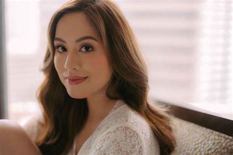
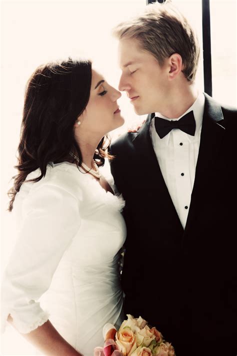
In the bustling world of beauty blogging, captivating visuals are no longer a luxury but a necessity. While crisp product shots are foundational, truly elevated “Artistry Enhanced” photography transcends mere documentation. It’s about creating an emotional connection, telling a story, and making your audience pause and admire. This means moving beyond a simple flash or overhead shot to strategically employing light and composition as powerful artistic tools.
Mastering Light: Sculpting Mood and Revealing Detail
Light is the painter’s brush in photography. How you harness it dictates the mood, highlights key features, and adds depth to your images.
- Soft, Diffused Natural Light: Often the most flattering, natural light from a window or open doorway creates gentle shadows and even illumination. Avoid direct sunlight, which can be harsh and create unflattering hotspots. Use a sheer curtain or a diffuser to soften it further, perfect for conveying a delicate or ethereal feel.
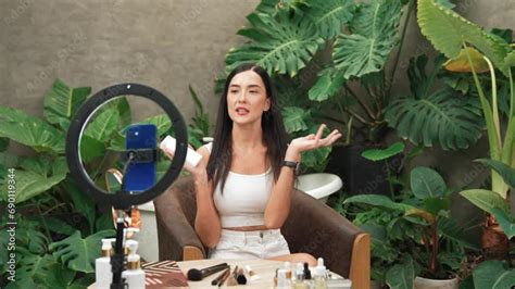
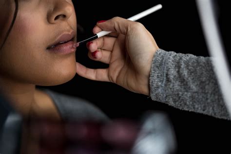
- Strategic Artificial Lighting: A ring light is excellent for even, shadowless illumination on a model’s face, ideal for makeup tutorials. For products, softboxes or LED panels can create more dramatic effects. Consider side lighting to emphasize texture, or backlighting to create a luminous glow around your subject, making it pop from the background.
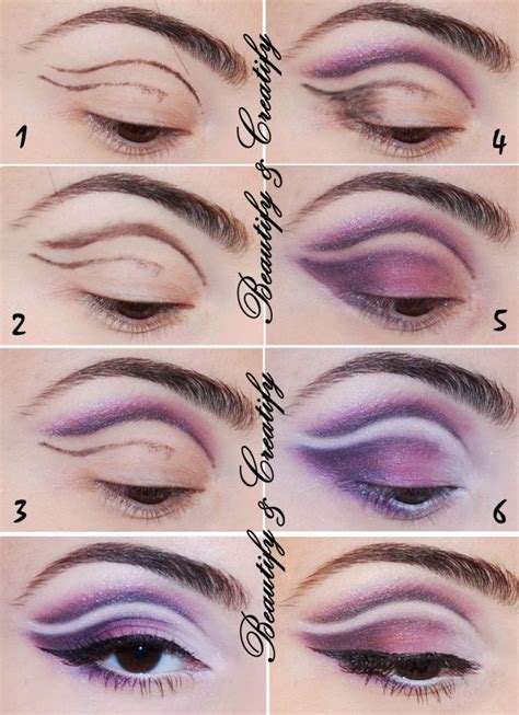
- Light Placement & Direction: Experiment with light sources from different angles. Side lighting adds dimension, while Rembrandt lighting (a triangle of light on the cheek opposite the light source) creates a classic, artistic look.

Compositional Brilliance: Guiding the Eye and Crafting Narratives
Composition is how you arrange elements within your frame to create a pleasing and impactful visual. It’s about storytelling without words.
- The Rule of Thirds: Imagine your frame divided into nine equal segments by two horizontal and two vertical lines. Placing your main subject or points of interest along these lines or at their intersections creates more dynamic and engaging compositions than simply centering everything.
- Leading Lines & Framing: Use natural lines (e.g., a brush handle, a tabletop edge, or a model’s arm) to draw the viewer’s eye towards your main subject. Framing, using elements in the foreground to enclose your subject, adds depth and focuses attention.
- Negative Space: Don’t be afraid of empty areas. Negative space around your subject allows it to breathe and stand out, preventing visual clutter and creating a sense of calm or sophistication.

Adding Depth and Texture: Beyond the Flat Lay
While flat lays are popular, incorporating depth and varied textures elevates them considerably.
- Depth of Field (Bokeh): Using a wider aperture (smaller f-number) will blur the background, making your product or model stand out sharply against a pleasingly soft, out-of-focus backdrop. This technique instantly adds a professional, luxurious feel.
- Textural Backdrops & Props: Think beyond a plain white board. Marble, raw wood, silk, velvet, or concrete provide rich tactile interest. Incorporate relevant, aesthetically pleasing props—fresh flowers, delicate jewelry, a beautiful teacup—that complement your product without overwhelming it.
- Layering & Levels: Arrange items at different heights and depths to create visual interest. Stack books, use risers, or angle products to create a dynamic sense of space.

Color Harmony and Storytelling Through Props
The colors in your image and the story your props tell are crucial for setting the tone.
- Color Palettes: Choose colors that either complement your product (e.g., cool tones for a hydrating serum) or create a striking contrast. Monochromatic schemes can evoke elegance, while a pop of a complementary color can draw immediate attention.
- Curated Props: Every prop should serve a purpose, whether it’s to evoke a mood (a cozy blanket for a night cream) or suggest a lifestyle. Avoid clutter; less is often more.

Post-Processing: The Final Polish
Editing is where you refine your vision. Subtle adjustments can make a significant difference.
- Color Correction & Grading: Ensure colors are true-to-life and consistent with your brand aesthetic. A slight warmth or coolness can dramatically shift the mood.
- Contrast & Clarity: Adjust these to make details pop and add dimension without over-saturating or making the image look artificial.
- Cropping & Straightening: Fine-tune your composition and ensure horizons or product lines are perfectly level.
By consciously integrating these lighting and compositional techniques, your beauty blog photography will evolve from simple product representation into a form of visual artistry. Each image will not only showcase a product but also tell a story, evoke an emotion, and ultimately, captivate your audience.