

What layout choices best enhance artistry and define elegance in a Pro Artist Portfolio?
The Canvas of Your Career: Layout as Artistic Expression
For a professional artist, a portfolio is more than just a collection of works; it’s a meticulously curated exhibition, a narrative, and a powerful statement of personal brand. The layout choices within this digital or physical space are paramount, acting as an invisible hand that guides the viewer, amplifies the impact of each artwork, and ultimately defines the portfolio’s elegance and artistic sophistication. It’s about creating an experience that resonates, leaving a lasting impression of professionalism and refined taste.
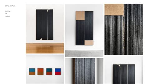
The Power of Minimalism and Negative Space
Elegance often whispers, it doesn’t shout. In portfolio design, this translates to the judicious use of minimalism and negative space. A clean, uncluttered layout ensures that the artwork remains the undisputed focal point, free from distracting elements. Negative space, the empty areas surrounding and between your art pieces, isn’t just blank; it’s a critical design element that allows each piece to breathe, providing visual respite and creating a sense of calm and sophistication. It enhances artistry by framing each work, allowing its unique qualities to shine without competition, thereby elevating the overall presentation.
Visual Hierarchy: Guiding the Eye with Purpose
An elegant portfolio directs the viewer’s gaze effortlessly, establishing a clear visual hierarchy. This involves strategic sizing, placement, and grouping of your artworks. Larger, prominently placed pieces often signal your strongest works, while smaller accompanying pieces might show range or supporting studies. Thoughtful use of typography for titles and descriptions also contributes to this hierarchy, ensuring information is absorbed easily. By dictating the flow, you control the story being told, ensuring that the most impactful pieces receive the attention they deserve and leading the viewer through your artistic journey with grace.
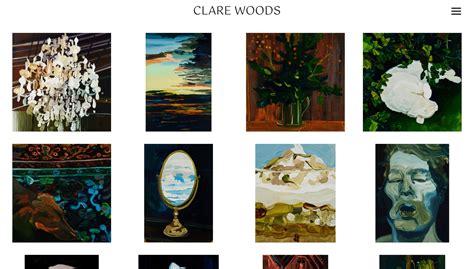
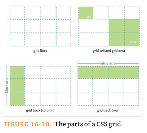
Grid Systems and Consistency: The Backbone of Cohesion
A well-defined grid system is the silent architect of an elegant portfolio. Whether it’s a symmetrical, asymmetrical, or modular grid, it provides an underlying structure that brings order and cohesion to your collection. Consistency in spacing, alignment, and presentation across all portfolio pages or sections is vital. This doesn’t mean rigidity; rather, it allows for creative variations within a predictable framework. A consistent grid system subconsciously reassures the viewer of the artist’s attention to detail and professionalism, projecting an image of organized thought and refined execution.
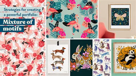
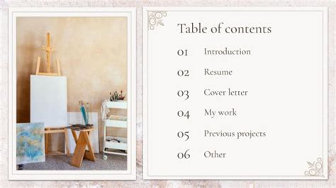
Project Presentation: Telling a Story with Each Piece
Beyond individual artwork display, the layout choices for presenting entire projects or series are crucial. Consider creating dedicated project pages that allow for a deeper dive, potentially including process sketches, inspiration boards, or detailed descriptions. A gallery layout that allows viewers to click through a series, or a responsive grid that adapts gracefully to different screen sizes, enhances the experience. Each project should feel like a complete narrative, thoughtfully introduced and concluded, rather than just a compilation of images. This holistic approach to project presentation reflects a mature and deliberate artistic practice.

Typography and Color Palette: Subtle Reinforcements
The fonts you choose for your portfolio titles, descriptions, and navigation are extensions of your artistic voice. Elegant portfolios often opt for clean, legible typefaces that complement the artwork without overpowering it. Similarly, a carefully selected, subdued color palette for backgrounds and text can enhance the artwork’s vibrancy and overall mood without competing for attention. These subtle layout elements work in harmony to reinforce the artistic integrity and sophisticated aesthetic of the portfolio.

Responsive Design and Intuitive Navigation: Seamless Experience
In today’s digital landscape, a portfolio must be as accessible on a smartphone as it is on a desktop monitor. Responsive design, which automatically adjusts layout for various screen sizes, is not merely a technicality but a critical aspect of elegance. Paired with intuitive navigation – clear menus, easy-to-find contact information, and logical pathways through your work – it ensures a seamless and enjoyable user experience. A portfolio that is difficult to navigate or view on different devices detracts from its professional appeal, regardless of the quality of the art it contains. Elegance extends to the usability of the entire platform.
Conclusion: The Art of the Presentation
Ultimately, the layout of a professional artist’s portfolio is an art form in itself. It is the silent curator, the sophisticated presenter, and the eloquent advocate for your creative vision. By embracing minimalism, defining clear visual hierarchies, utilizing consistent grid systems, and ensuring a seamless user experience, artists can create a portfolio that not only showcases their work but amplifies its artistry and radiates an undeniable sense of elegance. These deliberate choices transform a collection of images into a compelling, professional statement that captivates and persuades.