

What layout choices elevate a Pro Artist Portfolio to ‘Artistry Enhanced, Elegance Defined’?
For a professional artist, a portfolio is far more than a mere collection of works; it’s a curated narrative, a visual resume, and a powerful statement of personal brand and artistic vision. In a competitive creative landscape, the difference between a good portfolio and an exceptional one often lies not just in the quality of the art itself, but in how it is presented. The layout choices made can elevate a portfolio from a simple display to an ‘Artistry Enhanced, Elegance Defined’ experience, leaving an indelible impression on gallerists, clients, and collaborators.
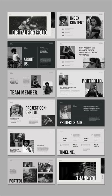
The Foundation: Clarity and Intentionality
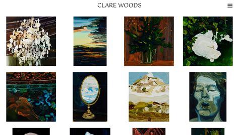
At the heart of an elevated portfolio lies clarity and intentionality. Every element, from the navigation flow to the spacing between pieces, must serve a purpose. A cluttered or confusing layout detracts from the art, while a well-organized one spotlights it. Think like a curator: which pieces speak most powerfully, and how can they be arranged to maximize their impact?

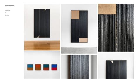
Embracing Negative Space: The Power of ‘Less’
Often underestimated, negative space (or white space) is a critical design element that provides visual breathing room, allowing individual artworks to truly shine. Cramming too many pieces onto a page or screen creates visual noise. Ample negative space guides the viewer’s eye, reduces cognitive load, and imparts a sense of sophistication and deliberate arrangement. It signifies confidence in your work, allowing each piece to stand on its own merit without competing for attention.
Furthermore, negative space contributes to a feeling of luxury and professionalism. It suggests that the art itself is valuable enough to warrant its own distinct presence, free from distractions. This principle applies whether you’re designing a physical book or a digital web portfolio.
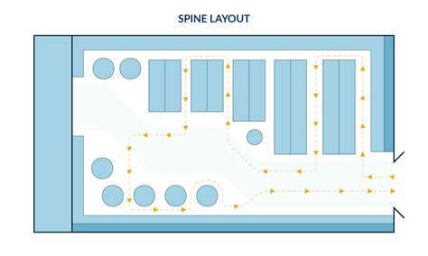
Establishing Visual Hierarchy and Flow
A successful portfolio layout creates a clear visual hierarchy, subtly directing the viewer through your body of work. This means strategically placing your strongest pieces – your “hero” works – where they will be seen first and make the greatest impact. Use size, position, and color contrast to emphasize key pieces. Think about the story you want to tell and how each piece contributes to that narrative.
The flow should be intuitive, guiding the viewer from one section to the next without effort. For digital portfolios, this means logical navigation, clear calls to action (e.g., “View Series,” “Contact”), and a responsive design that adapts seamlessly to various devices. For physical portfolios, consider the tactile experience – paper quality, binding, and the sequence of pages.
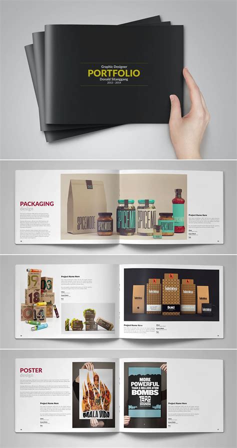
Consistency and Branding: A Unified Vision
An elegant portfolio extends beyond individual pieces; it presents a unified artistic brand. This requires consistency in layout elements: font choices, color palettes (if used for background or text), image sizing, and overall aesthetic. Does your portfolio’s design reflect the style and mood of your art? A minimalist artist might opt for a clean, grid-based layout, while a vibrant expressionist might incorporate more dynamic elements, though always with a sense of control and purpose.
Consistency builds trust and professionalism, reinforcing your identity as a serious artist. It shows that you are meticulous not only in your art-making but also in its presentation.
The Digital Dimension: Responsiveness and Interactivity
In today’s digital age, most professional portfolios exist online. This introduces new layout considerations: responsiveness, loading speed, and subtle interactivity. A portfolio must look impeccable on desktops, tablets, and smartphones alike. High-resolution images should be optimized for web viewing to ensure quick loading times without compromising quality. Subtle animations or hover effects can add a touch of modern elegance without distracting from the art.
Consider features like lightboxes for detailed views of artworks, and clear links to artist statements, CVs, and contact information. The digital experience should be smooth and frictionless, mirroring the refined quality of the art itself.
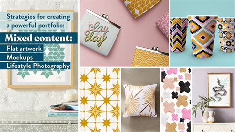
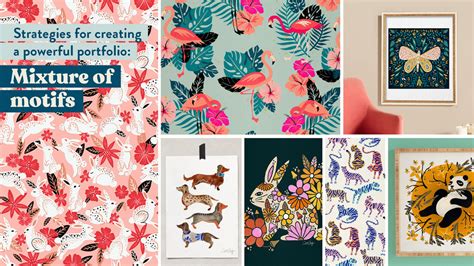
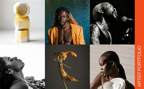
Curating the Narrative: Telling Your Story
Beyond individual layout elements, the overarching structure of your portfolio should tell a story. Group related works into series or themes. Provide concise, impactful descriptions or artist statements that offer context without overshadowing the visual experience. The layout becomes the silent narrator, guiding the viewer through your creative journey, revealing your skills, inspirations, and artistic evolution.
The ultimate goal is to create an experience that resonates, one where the presentation enhances the perception of your artistry. When layout is approached as an integral part of the creative process, a portfolio transcends mere display and truly becomes ‘Artistry Enhanced, Elegance Defined’.