

What specific layout/design choices enhance “elegance defined” in a digital art portfolio?
Crafting Sophistication: Elevating Your Digital Art Portfolio
In the competitive realm of digital art, a portfolio isn’t merely a collection of work; it’s a curated experience, a statement of your professional identity. To define “elegance” within this digital space means transcending mere aesthetics to create a seamless, sophisticated journey for the viewer. This requires deliberate choices in layout and design that speak volumes about your attention to detail and artistic sensibility.
The Power of Minimalism and Purposeful Negative Space
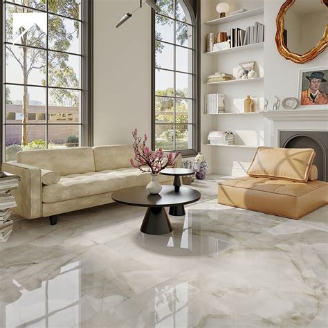
Elegance often whispers, it doesn’t shout. This principle is paramount in digital portfolio design. A minimalist approach declutters the visual field, allowing your artwork to breathe and take center stage. Avoid excessive UI elements, busy backgrounds, or superfluous animations. Instead, embrace negative space – the intentional areas of emptiness around and between elements. This “white space” isn’t wasted; it frames your pieces, enhances readability, and creates a sense of calm and sophistication, guiding the viewer’s eye precisely where you want it to go.
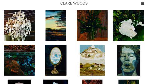
Consider a grid-based layout for consistency, but ensure there’s ample padding and margin around each artwork thumbnail or project entry. This visual breathing room prevents your portfolio from feeling crowded and underscores a sense of deliberate curation.
Refined Typography and Harmonious Color Palettes
The choice of typography is a subtle yet powerful arbiter of elegance. Opt for clean, readable fonts that complement your artistic style without overpowering it. A classic serif for headings combined with a modern, elegant sans-serif for body text can strike a sophisticated balance. Limit your font choices to no more than two or three to maintain visual coherence.
Similarly, a carefully selected color palette contributes immensely. Generally, a sophisticated portfolio leans towards a limited, often muted, color scheme. Think neutrals, subtle grays, deep charcoals, or soft pastels, punctuated by perhaps one accent color that aligns with your branding. These choices should enhance, not distract from, your artwork.

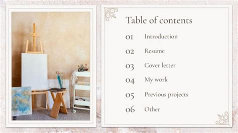
Intuitive Navigation and Clear Visual Hierarchy
An elegant portfolio is effortlessly navigable. Viewers should never feel lost or confused about how to explore your work. Implement a simple, clear navigation menu, typically positioned at the top or side, that is easily accessible from any page. Categories should be logical and concise. Visual hierarchy ensures that the most important information (your artwork) is immediately apparent, with supporting details (project descriptions, process insights) accessible but secondary.
This means employing thoughtful sizing, placement, and contrast to guide the user’s journey. Large, prominent artwork images, for instance, naturally draw the eye before smaller text descriptions.
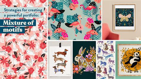
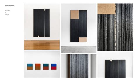
Seamless High-Quality Artwork Presentation
The core of an art portfolio is, naturally, the art itself. Presenting your work with utmost quality is non-negotiable for elegance. Ensure all images are high-resolution, professionally cropped, and optimized for web viewing to load quickly without sacrificing detail. Consistency in image sizing or aspect ratios across a gallery can create a harmonized, professional look.
Consider features like a smooth lightbox viewer for detailed examination of individual pieces, or subtle transition effects when moving between projects. The goal is to make the viewing experience as fluid and enjoyable as possible, allowing the art to shine without technical interruptions.

Subtle Interactivity and Responsive Design
While minimalism is key, subtle interactivity can enhance elegance. Gentle hover effects on project thumbnails, smooth scrolling, or a minimalist loading animation can add a touch of polish without becoming a distraction. The key word here is “subtle” – avoid anything that feels gratuitous or flashy.
Finally, true elegance in a digital age demands flawless responsiveness. Your portfolio must adapt gracefully to any screen size, from a large desktop monitor to a smartphone. A design that breaks or becomes clunky on different devices instantly undermines any attempt at sophistication. Test rigorously across various platforms to ensure a consistent, elegant experience everywhere.
Conclusion: The Art of Deliberate Design
Achieving “elegance defined” in a digital art portfolio is an art in itself. It’s the result of deliberate choices: embracing minimalism, curating typography and color, crafting intuitive navigation, presenting artwork impeccably, and ensuring a seamless experience across all devices. By focusing on these specific layout and design principles, you transform your portfolio from a mere collection into a sophisticated digital gallery that reflects the caliber and elegance of your artistic vision.