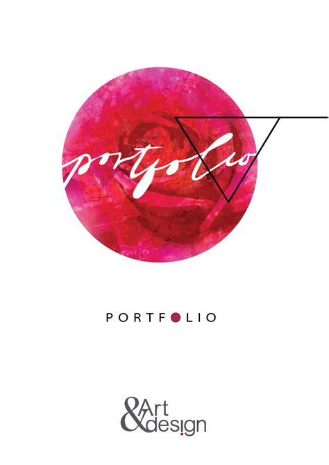


What specific layout & visual cues amplify artistry & define elegance in a professional portfolio?

For any artist, a professional portfolio is more than just a collection of work; it’s a meticulously crafted narrative of their creative journey and capabilities. To truly stand out, a portfolio must not only display exceptional art but also articulate artistry and elegance through its very design. This requires a strategic understanding of layout principles and visual cues that collectively elevate the presented work.
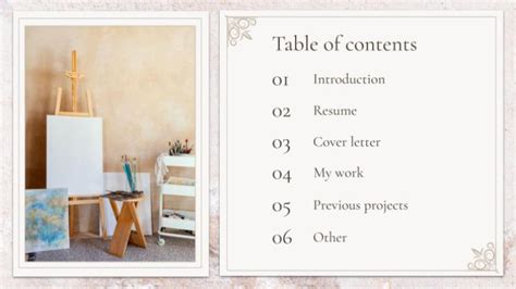
The Strategic Power of Layout: Guiding the Viewer’s Eye
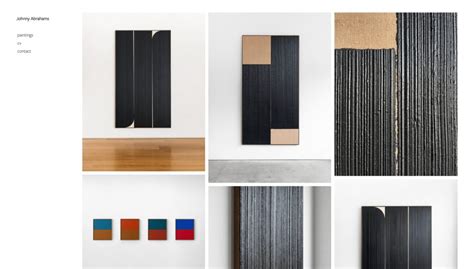
The foundation of an elegant portfolio lies in its layout. A well-structured layout isn’t merely aesthetic; it’s functional, guiding the viewer through your work in a logical and engaging manner. Key elements include the intelligent use of white space, a clear grid system, and a defined visual hierarchy. White space, often underestimated, provides breathing room, allowing individual pieces to command attention without competing for focus. It creates a sense of calm and sophistication. A consistent grid system brings order and professionalism, ensuring alignment and balance across all pages or sections.
Visual hierarchy, on the other hand, directs the eye. By varying sizes, positions, and contrast, you can emphasize your strongest pieces or most relevant information first, ensuring that crucial elements are not overlooked. This deliberate organization tells a story about your work, demonstrating thoughtfulness even before a piece is fully examined.
Curating Visual Harmony: Color, Typography, and Consistency
Beyond structure, the choice of visual cues plays a critical role in defining elegance and amplifying artistry. A cohesive color palette, often neutral or complementary to your artwork, sets a sophisticated tone without overpowering the art itself. Subtle accents can be used to highlight interactive elements or important text.
Typography also speaks volumes. Selecting legible, elegant fonts (typically one or two families) for titles, descriptions, and contact information contributes significantly to the portfolio’s overall aesthetic. The chosen typefaces should reflect your artistic personality and professional brand. Moreover, maintaining absolute visual consistency across all elements – from image treatment to spacing and button styles – reinforces professionalism and attention to detail, signaling a refined aesthetic sensibility.
Emphasizing Artistry Through Detail and Narrative
True artistry in a portfolio is amplified not just by the quality of the work itself but by how it’s presented. High-resolution imagery, perfectly cropped and color-corrected, is non-negotiable. Blurry or poorly lit photos diminish even the most brilliant creations. Furthermore, consider including process work, sketches, or behind-the-scenes glimpses for select pieces. This not only adds depth but also humanizes your artistry, allowing viewers to appreciate the thought and effort involved.
Short, concise project descriptions or case studies that explain your role, the challenge, and your solution, provide crucial context. This narrative approach transforms a static image into a compelling story, showcasing your problem-solving skills and creative thinking. This level of detail elevates the perception of your work from mere display to a demonstration of professional capability and artistic intent.

Defining Elegance: Subtlety, Interactivity, and Seamlessness
Elegance in a portfolio often stems from subtlety and a focus on the user experience. A minimalist design approach, free from unnecessary embellishments, allows the artwork to be the undisputed star. Clean lines, ample white space, and a restrained use of design elements communicate a sense of sophistication and confidence.
Furthermore, if your portfolio is digital, seamless navigation and responsiveness are paramount. An elegant portfolio loads quickly, adapts flawlessly to different devices, and offers an intuitive path through your work. Any friction in the user experience detracts from the perceived professionalism and elegance. Consider subtle interactive elements, like hover effects or discreet animations, that enhance engagement without being distracting or ostentatious.

The Unspoken Element: Personal Branding and Authenticity
Ultimately, a truly elegant and artistically compelling portfolio resonates with your unique personal brand. Every layout choice, every visual cue, and every piece of content should align with who you are as an artist and what you aim to achieve. Authenticity, coupled with meticulous presentation, creates a powerful and memorable impression. This personal touch, wrapped in a polished, professional package, is what truly amplifies your artistry and defines an enduring elegance that sets you apart.

In conclusion, crafting a professional portfolio that amplifies artistry and defines elegance is an art form in itself. It demands a holistic approach where strategic layout, refined visual cues, compelling narrative, and an unwavering commitment to quality converge. By mastering these elements, artists can transform their portfolio from a simple collection into a powerful statement of their creative prowess and professional sophistication, leaving a lasting and impactful impression on every viewer.