

What subtle design choices elevate a Pro Artist Portfolio to exude refined elegance?

The Art of Understated Sophistication
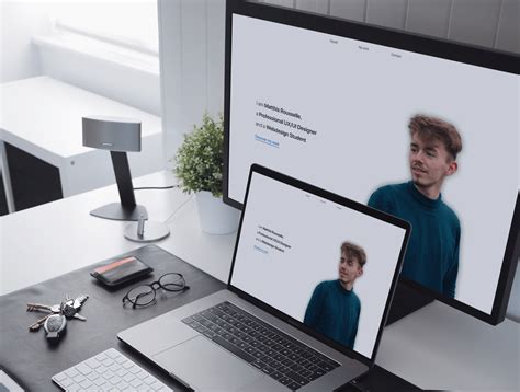
For a professional artist, a portfolio is far more than a collection of work; it’s a meticulously curated statement of their brand, aesthetic, and professional caliber. While bold statements can grab attention, it’s the subtle, often overlooked design choices that truly elevate a portfolio from good to exquisitely elegant. This refinement isn’t about ostentation, but about a thoughtful orchestration of elements that create an immersive, luxurious experience for the viewer, letting the art speak volumes without unnecessary fanfare.
Refined elegance in a portfolio hinges on the principle of ‘less is more,’ where every design decision is intentional, contributing to an overall sense of calm, confidence, and distinction. It’s about crafting an environment that doesn’t just showcase art, but venerates it.
Embracing Negative Space with Purpose
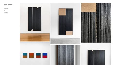
Perhaps the most potent, yet subtle, design choice is the intelligent use of negative space. Far from being empty, negative space is a powerful design element that provides breathing room for each artwork. It prevents visual clutter, guides the viewer’s eye, and creates a sense of luxury and exclusivity. When artwork is given ample space to exist on its own, it gains prominence and impact, reflecting a designer’s confidence in the art itself.
This deliberate spaciousness communicates a sense of calm and sophistication, allowing the viewer to absorb each piece without feeling rushed or overwhelmed. It’s the visual equivalent of a well-appointed gallery, where each piece is a discovery rather than part of a crowded display.
Thoughtful Typography and Hierarchy
Typography is the voice of your portfolio, and its subtlety is key to elegance. Opting for clean, highly legible typefaces with a classic or timeless appeal over overly decorative or trendy fonts immediately conveys professionalism. The magic lies in the hierarchy: a considered pairing of one or two complementary fonts used consistently for titles, descriptions, and navigational elements.
Subtle variations in weight, size, and color (often a muted gray or charcoal rather than stark black) can differentiate information without shouting. This meticulous attention to typographic detail ensures that text supports the artwork rather than competing with it, adding a layer of sophisticated readability.
The Nuance of a Curated Color Palette
An elegant portfolio typically adheres to a highly restrained and thoughtful color palette. This often means a largely monochromatic or analogous base (think soft grays, warm whites, deep charcoals, or muted earth tones) with perhaps one or two carefully chosen accent colors used sparingly. The goal is for the background and interface elements to recede, allowing the vibrant colors and textures of the artwork to take center stage.
This refined approach to color avoids distractions and creates a harmonious backdrop, reinforcing the idea that the portfolio is a professional, cohesive presentation rather than a chaotic display. The chosen palette should ideally complement the artist’s dominant body of work or personal brand.
Intuitive Navigation and User Experience
Elegance also extends to the user experience. A portfolio that truly exudes refined taste will feature intuitive, almost invisible navigation. This means simple menus, clear calls to action, and smooth transitions between pages or artwork views. The goal is to make the journey through the portfolio effortless, removing any friction that might pull the viewer away from the art.
Seamless responsiveness across devices, rapid loading times, and a logical flow of content are not just functional requirements; they are subtle cues of professionalism and respect for the viewer’s time and attention. Any element that feels clunky or confusing detracts from the overall sophisticated impression.

Impeccable Visual Presentation of Artwork
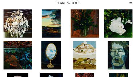
Finally, the way the artwork itself is presented within the design frame is crucial. This involves high-resolution, perfectly lit, and expertly cropped images of the artwork. Consistency in how pieces are framed or displayed (e.g., all shown against a uniform background, or with consistent spacing) speaks volumes about an artist’s professionalism.
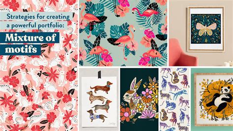
Beyond the individual pieces, the overall sequencing and curation of the artwork tell a story. An elegant portfolio doesn’t necessarily show everything, but rather the strongest, most cohesive pieces that define the artist’s current direction and skill level. This curated selection reinforces the sense of discernment and quality.

The Cumulative Effect of Subtlety
Ultimately, refined elegance in a professional artist’s portfolio is the cumulative effect of these subtle design choices. It’s not about one grand gesture, but about a symphony of understated elements working in harmony to create an experience that feels considered, professional, and deeply respectful of both the art and the viewer. By mastering these nuances, an artist can present not just their work, but their entire professional persona with undeniable sophistication and lasting impact.