
What visual hierarchy strategies make a Pro Artist Portfolio truly “Artistry Enhanced, Elegance Defined”?

The Unseen Architect: Why Visual Hierarchy Matters in Your Portfolio
For a professional artist, a portfolio is far more than just a collection of work; it’s a meticulously curated narrative, a visual argument for one’s skill, vision, and unique voice. To truly elevate this narrative from ‘good’ to ‘Artistry Enhanced, Elegance Defined,’ understanding and applying visual hierarchy strategies is paramount. Visual hierarchy is the principle of arranging elements to show their order of importance, guiding the viewer’s eye through your work in a logical and impactful way. Without it, even the most stunning individual pieces can get lost in a sea of visual clutter, failing to make the lasting impression they deserve.
A well-executed visual hierarchy ensures that your strongest pieces receive the attention they merit, that your stylistic coherence is evident, and that the overall experience for the viewer is one of professional polish and thoughtful curation. It’s about creating an intuitive flow that not only showcases your art but also communicates your brand and aesthetic sensibilities.
Establishing a Clear Focal Point: Your Hero Pieces First
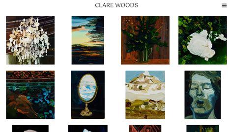
The first rule of visual hierarchy in an artist’s portfolio is to identify and emphasize your most compelling, relevant, or innovative pieces. These are your ‘hero’ works, and they should immediately command attention. You can achieve this by making them larger, placing them centrally, or isolating them with ample white space compared to surrounding elements. Think of your portfolio’s landing page or opening spread: what single image or small group of images will instantly convey your strongest capabilities? Don’t make viewers hunt for your best work; lead with it, strategically placing it where the eye naturally falls first.
This deliberate placement establishes a strong first impression and sets the tone for the rest of your portfolio, signaling to the viewer what kind of artistry they can expect to encounter.
Leveraging Scale and Contrast for Dynamic Impact
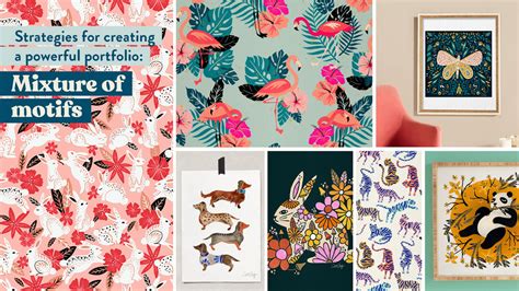
Varying the size and contrast of your artworks is a powerful way to create visual interest and guide the eye. Larger pieces naturally draw more attention, so reserve this emphasis for your most significant works. However, scale isn’t just about making things big; it’s about making them *different*. A small, exquisitely detailed piece placed next to a much larger, simpler one can create a fascinating dialogue and highlight the nuances of your skill. Similarly, contrast in color, value, texture, or even subject matter can create a compelling visual dynamic.
Utilizing strong contrast, for example, by pairing a vibrant, high-saturation piece with a muted, monochromatic one, can prevent visual monotony and underscore the breadth of your artistic range. This strategic use of scale and contrast keeps the viewer engaged, encouraging them to explore deeper into your collection.
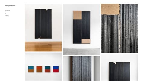
The Power of Grouping and White Space
Clustering related works together – be it by series, theme, medium, or date – helps viewers understand your artistic journey and thematic explorations. Proximity is a fundamental principle of visual hierarchy; elements that are close together are perceived as belonging together. Grouping prevents your portfolio from feeling like a random assortment of images.
Equally critical is the deliberate use of white space (or negative space). White space isn’t empty; it’s a design element that gives your art room to breathe, prevents visual fatigue, and creates a sense of elegance and sophistication. Generous white space around your key pieces can elevate their perceived value and allow them to speak for themselves without competition. It also makes your portfolio feel clean, organized, and intentional, reflecting a refined aesthetic.
Guiding the Viewer’s Eye with Flow and Direction
A truly ‘Artistry Enhanced’ portfolio takes the viewer on a journey. Think about the natural way people scan information – often in a Z-pattern or F-pattern online, or from left-to-right, top-to-bottom in print. Arrange your works to capitalize on these natural inclinations. Create a logical progression that tells a story, perhaps moving from concept to finished piece, or showcasing a chronological development of your style. Arrows, lines, or even the implied direction within an artwork can subtly guide the eye from one piece to the next, fostering a seamless viewing experience.
This thoughtful sequencing demonstrates not just your skill, but also your ability to curate and present your work with a clear purpose and a defined narrative.
Consistency, Branding, and Refined Aesthetics

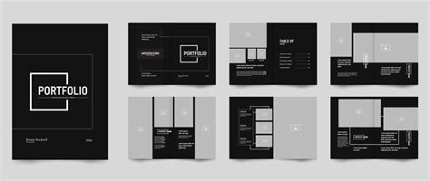
Finally, the ‘Elegance Defined’ aspect of your portfolio comes from unwavering consistency in its presentation. This includes maintaining a unified aesthetic across all elements: consistent font choices for titles and descriptions, a harmonious color palette (even if it’s mostly neutral), and a repetitive layout structure where appropriate. Your portfolio itself should reflect your artistic brand, acting as an extension of your creative identity.
Every element, from the spacing between images to the quality of your image captures, contributes to the overall impression of professionalism and attention to detail. A consistent, branded visual hierarchy subtly communicates reliability, a strong sense of self, and an unyielding commitment to quality in every facet of your artistic practice.
Conclusion: Beyond the Art, The Presentation Defines the Artist
To craft a professional artist portfolio that truly embodies “Artistry Enhanced, Elegance Defined,” mastering visual hierarchy is indispensable. It’s the silent force that transforms a mere display into a compelling experience. By strategically establishing focal points, leveraging scale and contrast, utilizing grouping and white space, guiding the viewer’s eye, and maintaining consistent branding, you elevate your presentation to reflect the true depth and sophistication of your creative talent. Your portfolio becomes not just a window into your world, but a powerful statement of your artistic prowess and meticulous professionalism.