


What visual hierarchy techniques define an elegant, enhanced Pro Artist Portfolio?

The Foundation of an Impactful Artist Portfolio
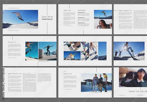
For a professional artist, a portfolio is more than just a collection of work; it’s a carefully curated narrative, a visual resume that speaks volumes about skill, style, and professionalism. The difference between a good portfolio and an outstanding, elegant one often lies in the subtle yet powerful application of visual hierarchy. These techniques dictate how a viewer’s eye navigates the page, ensuring that the most important pieces receive the attention they deserve and the overall experience is intuitive and memorable.
Guiding the Eye with Scale and Proportion
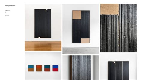
One of the most fundamental principles of visual hierarchy is the strategic use of scale and proportion. Larger elements naturally draw more attention. In a portfolio, this means your strongest, most representative artworks should be displayed more prominently than supporting pieces. Imagine a gallery wall: a masterpiece is often given central, larger placement. Similarly, on a digital or physical portfolio page, varying the size of images creates a clear focal point. Don’t be afraid to let a signature piece dominate a spread, while other related works provide context in smaller formats around it.
The Power of Contrast and Color
Contrast is a powerful tool to make elements stand out. This can be achieved through differences in color, tone, texture, or even shape. High-contrast elements, such as a brightly colored artwork against a muted background, immediately capture attention. Conversely, subtle variations can create depth and direct the eye to secondary information without being disruptive. Thoughtful color palettes, often leaning towards neutral backgrounds, ensure that the artwork itself is the star, while accent colors can be used judiciously for navigational elements or call-to-actions.
Strategic Use of Whitespace and Grouping
Whitespace, or negative space, is not empty space; it’s a design element that provides breathing room and clarity. Ample whitespace around individual pieces or sections prevents visual clutter and allows each artwork to be appreciated on its own merits. It also helps to define visual groups. Employing Gestalt principles, such as proximity (grouping related items close together) and similarity (using consistent styling for similar types of content), can create a sense of order and make complex information digestible. For instance, a series of works might be presented in a grid, while a standalone project receives its own dedicated space.
Typography as a Hierarchical Cue
Typography plays a crucial role beyond readability; it’s a key component of visual hierarchy. Varying font sizes, weights (bold vs. light), and styles (serif vs. sans-serif) helps distinguish titles from descriptions, project names from dates, and primary information from supplementary details. A consistent typographic system, typically with a clear hierarchy for headings, subheadings, and body text, enhances professionalism and makes your portfolio easier to scan and understand. Elegant portfolios often use a limited number of fonts, relying on variations within those families for distinction.
Flow and Navigation: Guiding the User’s Journey
An elegant portfolio anticipates the viewer’s journey. Techniques like F-patterns or Z-patterns (common eye-tracking patterns on web pages) can inform layout decisions, placing crucial information or standout works along these natural paths. Clear navigation, whether through intuitive menus or logical sequencing of projects, ensures that the viewer can effortlessly explore your body of work. A strong beginning (an impactful hero image or introductory statement) and a clear call to action (contact information or link to social media) frame the experience, making it complete and professional.
Consistency and Repetition for Cohesion
Repetition of design elements – consistent margins, identical button styles, or recurring color schemes – creates a sense of unity and professionalism throughout the portfolio. This consistency reinforces the visual hierarchy you’ve established and makes the entire presentation feel cohesive and intentional, rather than a disparate collection of individual pieces. An elegant portfolio always feels like a thoughtfully designed whole, where every element serves a purpose in presenting the artist’s unique vision.

Refining the Viewer’s Experience
Ultimately, an elegant and enhanced professional artist portfolio is one that respects the viewer’s time and attention. By meticulously applying visual hierarchy techniques—from adjusting scale and contrast to mastering typography and whitespace—artists can craft a compelling, easy-to-digest narrative of their creative journey. These techniques don’t just make a portfolio look good; they make it function better, ensuring that the artist’s talent is communicated with maximum impact and sophisticated grace.