

What visual hierarchy techniques define elegance and enhance artistry in a pro portfolio?

The Undeniable Power of Visual Hierarchy in Professional Portfolios
In the competitive realm of professional art, a portfolio serves as more than just a collection of works; it is a meticulously curated exhibition of your skill, vision, and professional acumen. While the quality of the artwork is paramount, its presentation through effective visual hierarchy is what truly defines elegance and enhances artistry, transforming a good portfolio into a truly exceptional one.
Visual hierarchy, at its core, is the strategic arrangement of elements to guide the viewer’s eye through a design, establishing an order of importance. For a professional portfolio, this means intentionally directing attention to your strongest pieces, showcasing your unique style, and creating an experience that feels both sophisticated and intuitive.
Defining Elegance Through Strategic Design Principles
Elegance in a portfolio is not merely about minimalist aesthetics; it’s about a refined presentation that feels effortless, intentional, and harmonious. Visual hierarchy achieves this through several key techniques:
1. Size and Scale: Commanding Attention
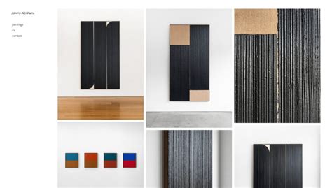
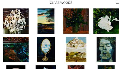
- Hero Images: By making your most impressive or representative artwork significantly larger than others, you immediately communicate its importance, drawing the viewer’s eye and establishing a focal point.
- Varying Proportions: Strategic variations in the size of thumbnails, textual elements, and navigational components create visual interest and prevent monotony, while still maintaining balance.
2. Color and Contrast: Guiding the Gaze
- Limited Palettes: An elegant portfolio often employs a restricted color palette, allowing the artwork itself to provide the primary bursts of color. Neutral backgrounds and subtle accent colors can elevate the work without competing with it.
- High Contrast for Key Elements: Using high contrast for calls to action, section titles, or the artwork itself ensures these critical elements stand out against their surroundings. Conversely, lower contrast can be used for less important information, allowing it to recede subtly.
3. Proximity and Grouping: Creating Cohesion
- Related Elements Together: Grouping similar pieces of information or artwork (e.g., a series of concept art, process sketches, or final renders for a single project) creates logical segments that are easy for the viewer to digest.
- Negative Space (Whitespace): Perhaps one of the most powerful tools for elegance, generous use of negative space around elements gives them room to breathe, prevents visual clutter, and enhances the perceived value and artistry of each piece. It creates a sense of luxury and calm.
4. Alignment and Grid Systems: Structured Sophistication
- Consistent Alignment: Meticulous alignment of all elements—text, images, navigation—creates an underlying sense of order and professionalism. Misaligned elements can instantly diminish a portfolio’s perceived quality.
- Underlying Grid: Utilizing a hidden grid system provides a structural backbone for your layout, ensuring consistency across pages and contributing to an overall sense of balance, harmony, and polished elegance.

Enhancing Artistry Through Intentional Presentation
Beyond mere elegance, visual hierarchy actively enhances the artistry showcased in your portfolio by:
1. Framing the Artwork
By using negative space, subtle borders, and strategic placement, visual hierarchy frames your art, elevating it from a simple image to a presented masterpiece. It tells the viewer, “This is important; pay attention.”
2. Directing Narrative Flow
A well-structured portfolio uses hierarchy to tell a story. Whether it’s guiding the viewer through your creative process on a project page or presenting a chronological evolution of your style, intentional design choices create a compelling narrative around your work.
3. Communicating Professionalism
An artist who pays attention to the presentation of their work demonstrates an acute eye for detail and a commitment to quality that extends beyond the canvas or screen. This level of professionalism instills confidence in potential clients or employers.
4. Highlighting Versatility and Specialization
Through careful grouping and emphasis, you can highlight both the breadth of your skills (versatility) and your specific areas of expertise (specialization) without overwhelming the viewer. Hero images can showcase your signature style, while smaller, related works demonstrate your range.

Practical Application in Your Portfolio
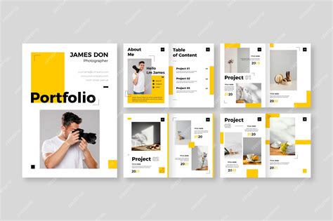
- Homepage: Feature one dominant, breathtaking piece that defines your aesthetic, surrounded by ample negative space and clear, minimal navigation.
- Project Pages: Lead with the final, polished artwork (large), followed by process work (smaller, grouped), and concise, readable descriptions.
- About Page: Use a clear typographic hierarchy for your biography, ensuring headings stand out and body text is easily digestible. A professional headshot should be well-placed, not dominant.

Conclusion
The visual hierarchy techniques employed in a professional artist’s portfolio are not just design frills; they are fundamental tools that define elegance and profoundly enhance the artistry on display. By thoughtfully applying principles of size, color, proximity, alignment, and negative space, artists can craft a portfolio that not only presents their work but elevates it, creating a sophisticated and unforgettable experience that resonates with a discerning audience.