
Which Pro Artist Portfolio layout options best define elegance & enhance my unique artistry?
For any professional artist, a portfolio is more than just a collection of work; it’s a curated statement of identity, skill, and vision. The layout you choose for your digital portfolio is paramount in defining elegance and ensuring your unique artistry shines through. It’s about creating an experience that captivates viewers, allowing your work to speak volumes without distraction.
The Foundation of Elegance: Minimalism and Intentional Design
Elegance in a portfolio often stems from simplicity and intentionality. A cluttered or overly complex design can detract from your art. Embracing minimalism isn’t about absence, but about highlighting what truly matters: your creations. This means prioritizing ample whitespace, a clean color palette, and clear, legible typography. These elements work together to create a sophisticated backdrop that doesn’t compete with your art but rather elevates it.
Consider the visual hierarchy: what do you want your viewer to see first? A truly elegant layout guides the eye naturally through your work, making the viewing experience intuitive and enjoyable. Every design choice, from the placement of thumbnails to the styling of your artist statement, should serve to underscore your artistic voice.
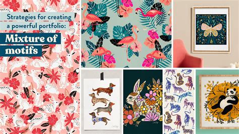
Layout Options to Showcase Unique Artistry
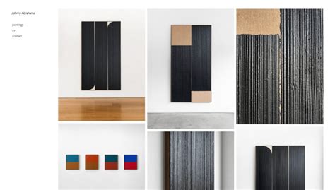
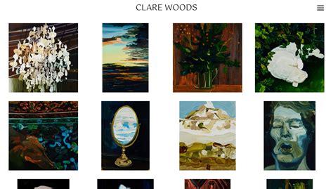
Grid Layouts: Order and Accessibility
Grid layouts are a classic for a reason. They offer structure and predictability, making it easy for viewers to navigate a large body of work. A well-executed grid, whether symmetrical or asymmetrical, can convey a sense of professionalism and organization. For artists with diverse series or a consistent aesthetic, a grid provides a clean, gallery-like experience. Ensure consistent thumbnail sizing or aspect ratios for a more polished look, allowing individual pieces to still pop within the uniform framework.
Full-Screen or Hero Image Layouts: Immediate Impact
If your work thrives on grand scale or demands immediate, immersive engagement, a full-screen layout or a prominent hero image can be incredibly powerful. This approach instantly draws the viewer into a single piece, setting a strong tone and demonstrating confidence in your art. It’s particularly effective for photographers, large-scale painters, or digital artists whose work benefits from an expansive display. Paired with subtle navigation, this option screams sophistication and high impact.
Masonry or Dynamic Grids: Organic Flow for Varied Works
For artists whose pieces come in a variety of sizes and aspect ratios, a masonry or dynamic grid layout offers an elegant solution. This style arranges images like interlocking bricks, maximizing space while maintaining visual harmony. It feels organic and less rigid than a traditional grid, reflecting a more fluid and evolving artistic practice. This layout is excellent for showcasing versatility without sacrificing an organized appearance.
Minimalist & Single-Image Focused Layouts: Purity of Form
Sometimes, the most elegant solution is to present one image at a time, allowing each artwork to command full attention. These layouts often feature arrow navigation or a discreet thumbnail strip, ensuring the focus remains solely on the current piece. This option is ideal for artists creating highly detailed, emotionally resonant, or conceptually complex works that demand individual contemplation. It elevates each piece to a singular experience, emphasizing quality over quantity.
Key Elements Beyond Layout for Enhanced Artistry
Typography and Color Palette: Subtlety is Key
The fonts you choose for titles, descriptions, and your artist statement must be legible and align with your artistic brand. A sophisticated sans-serif often pairs well with modern art, while a carefully selected serif can add a touch of classic elegance. Similarly, your color palette should complement, not overpower, your artwork. Muted tones, grays, blacks, and whites are often the safest and most elegant choices, allowing the colors in your art to truly pop.
Navigation and User Experience: Seamless Exploration
An elegant portfolio is also one that is easy to use. Intuitive navigation ensures visitors can effortlessly explore your work, find information, and connect with you. Simple menus, clear calls to action, and responsive design for various devices all contribute to a professional and elegant user experience. Avoid overly complex animations or hidden features that might frustrate a viewer.
Customization and Personal Branding
While templates offer a starting point, true elegance often comes from subtle customization that reflects your personal brand. This doesn’t mean reinventing the wheel, but rather finessing elements like your logo placement, the tone of your artist statement, or unique hover effects that subtly reveal details. The goal is to create a cohesive experience that feels uniquely ‘you’ – an extension of your artistic identity rather than just a generic display.
![15 Brilliant Artist Website Examples [2024]](/images/aHR0cHM6Ly90czQubW0uYmluZy5uZXQvdGg/aWQ9T0lQLms3bmpvQWphM3hVS1lzREZwLWhYYlFIYUV2JnBpZD0xNS4x.webp)
Conclusion: Balance and Authenticity
Ultimately, the best pro artist portfolio layout is one that strikes a perfect balance between timeless elegance and the authentic expression of your unique artistry. It’s about making conscious design decisions that showcase your work in its best light, create a memorable viewing experience, and reinforce your professional identity. By carefully considering minimalism, layout options, and supporting design elements, you can craft a portfolio that not only impresses but truly resonates with your audience.